Here’s what you came for
The Work


Redirect-U
About
Brief
Solution


Turich World Wide
About
Test
Brief
Test
Solution
Test


Delaware Alliance
About
Design and develop a website for survivors of sexual assault. The organization didn't have any established branding other than a teal color palette which represents sexual Assult Awareness. The organization had one request that had to be fulfilled, an exit button that all victims who are looking to help to quickly leave the site
Brief
Solution


Virtually Merritt
About
The owner of Virtually Merritt was looking to get her virtual assistant business off the ground and she came to me for full creative support. She hired me for a brand photoshoot, logo creation, and website design + Development.
Brief
Solution


Several Thousand Alliance
About
During my employment with the creative agency Hyperquake, I was tasked with developing a client website. The site's design was created by other designers on the team. I was asked to bring the static design to life.
Brief
Solution


School Of Ginga
About
The owners of the School of Ginga reached out to me for some creative support. Their original branding for the soccer academy was created in 2010 and many years passed without change. The member intake of the brand was strong but they felt the visual identity didn't reflect the business properly. They want the brand to feel exciting, fun, and rooted in foundation. I took from those sentiments and overhauled the entire brand identity with new logos, brand assets, and a website.
Brief
Solution


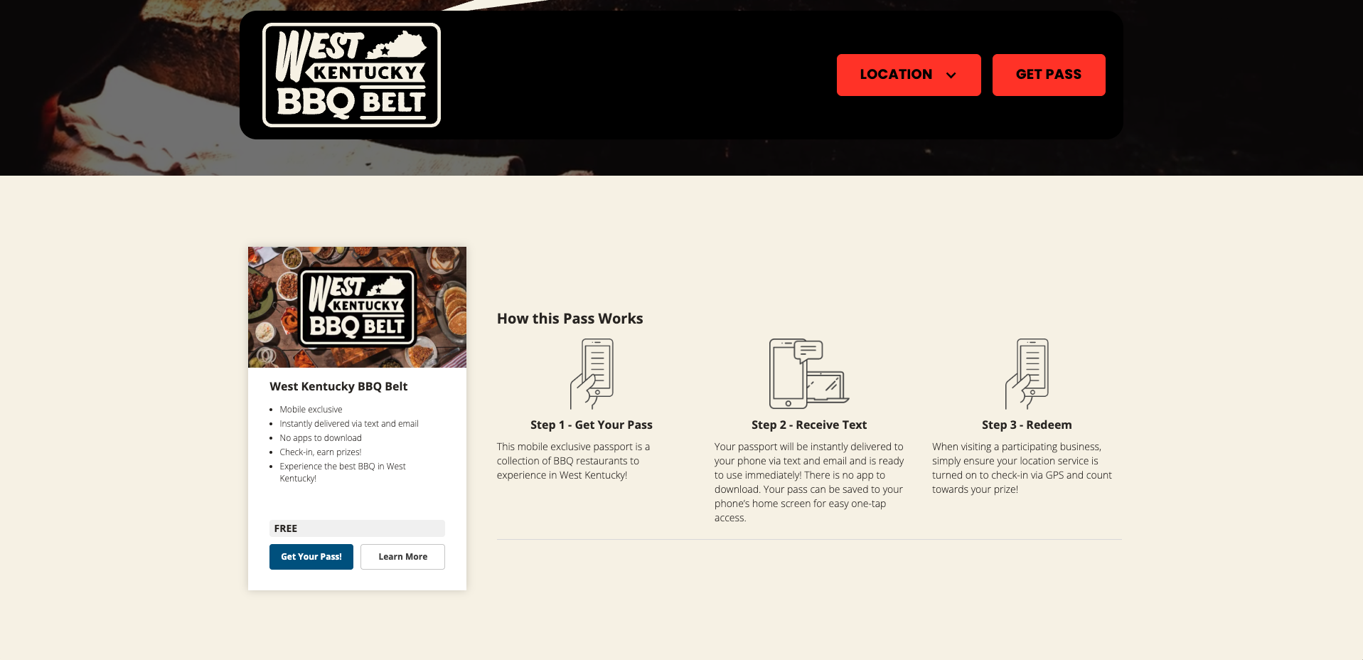
Western Kentucky BBQ Belt
About
Design and develop a website for Western Kentucky BBQ Belt. A visual identity was already established to help determine the site's design direction. Coomer Co. led this project, I was hired as a freelancer.
Brief
Solution


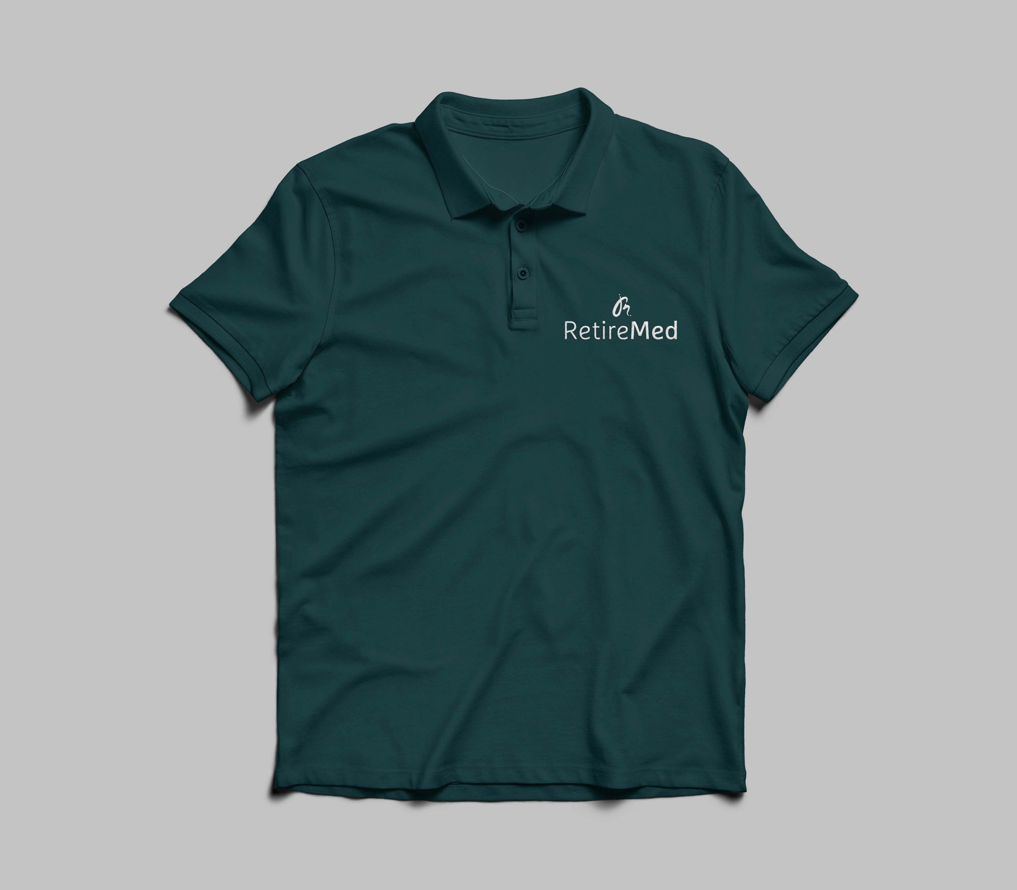
RetireMed IQ
About
RetireMed IQ reached out to Hyperquake for help with a brand identity refresh. I was tasked with delivering multiple concepts. The concept I was asked to lead with was a logo mark inspired by a journey or point A to point B, while at the same time the logo mark is creating a stylized combination of a letter R and letter M.
Brief
Solution


Cincinnati Bengals Spec Work
About
For a brief moment, I was interested in working for the Cincinnati Bengals. I thought it would work in my favor to create a few game day posters to get their attention and to show them what kind of work I could produce.
Brief
Solution


Greenworks
About
I was on the design team for the global company Greenworks while working at a creative agency. I was assigned to work on various design projects across Greenworks vast portfolio of target audiences and departments.
Brief
Solution


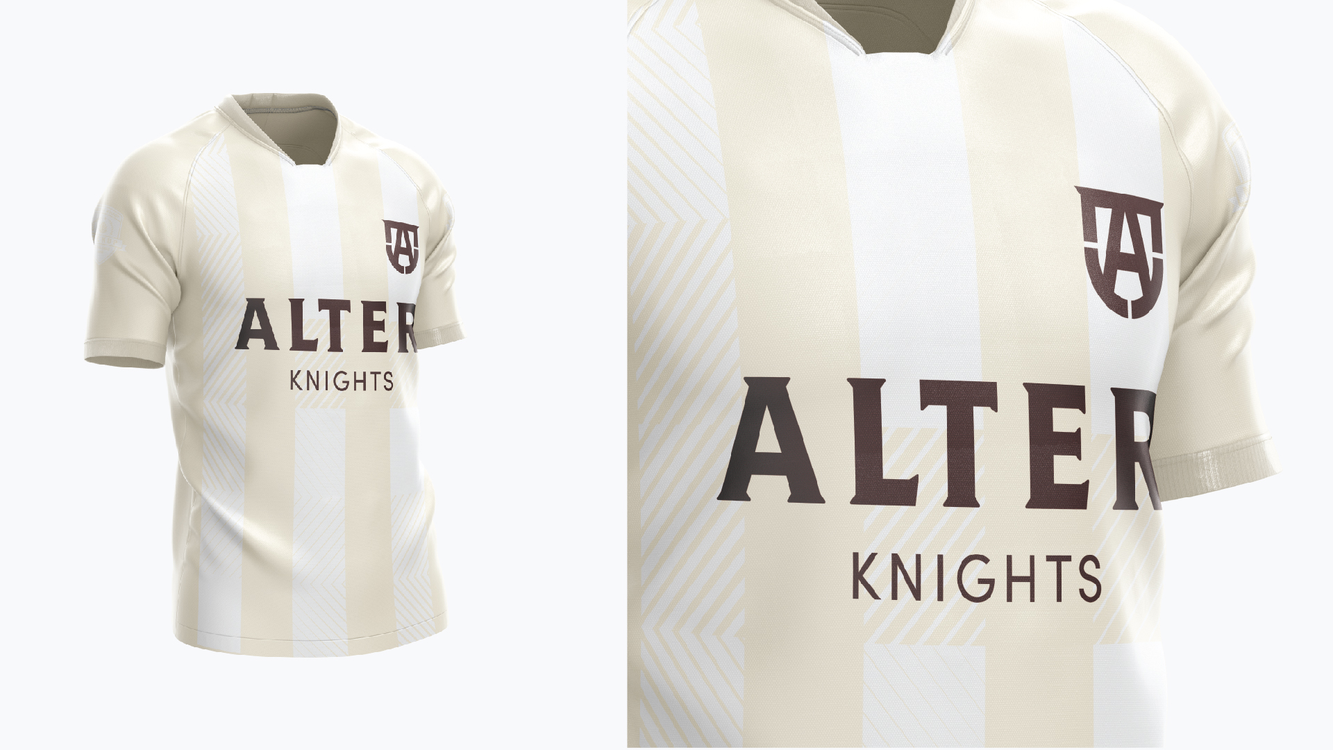
Alter High School
About
Alter High School felt it was time for a fresh take on their brands visual identity. I was introduced to the project right before they had to deliver their first round of logos. I was asked to quickly deliver a couple concepts to add a verity to what was being shown to the client. Among my concepts I presented a shield and capital letter "A" mark that I was asked to bring forward. My favorite concept I created was a Knight on the horse in a shape of a stylized capital letter "A".
Brief
Solution


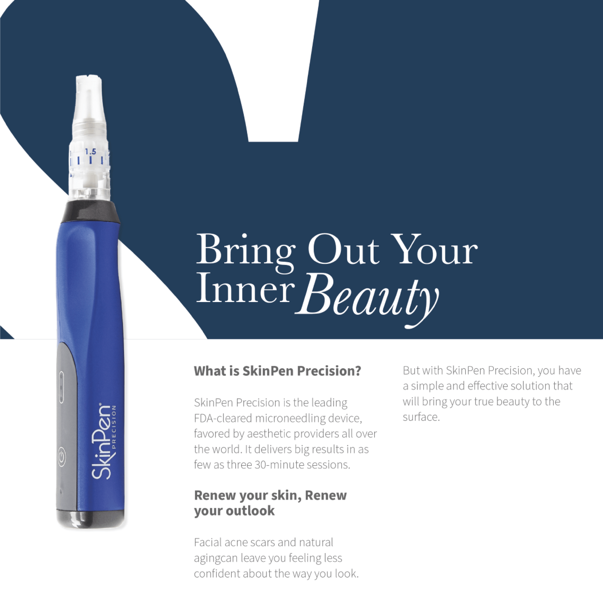
SkinPen
About
The skincare brand SkinPen needed to update a patient brochure. Using their some of there exciting brand principles and experimenting with some new ones I was tasked with creating concepts to help drive the brochure's redesign.
Brief
Solution


CoolSculpting
About
The company Cool Sculpting added new applicators to their lineup. A brand guideline, photography, and copy, were provided. Alongside other creatives on the team, we were tasked with conceiving new potential key visuals. These were the designs I created to have pitched to the client.
Brief
Solution


Summit Country Day
About
During my first design internship I had the honor to create the updated brand mark for Summit Country Day School (SCD). As an intern I was on the team mainly for support but the creative director wanted to give me a chance at bat. SCD expressed how it was time for a refresh and they wanted something that felt modern and collegiate but not to lose historical essence of the original logo. I delivered a mark that was a stripped down version of the iconic SCD crest and choosing to keep the chevron which symbolic represented their core vales in many ways. And to my surprise the client loved it!
Brief
Solution


Great Big Post Card
About
as their photographer for a Team Kentucky campaign called the "Great Big Kentucky Adventure". This kid-to-kid campaign features 4’ x 6’ recyclable postcards with hand-written letters from little Kentuckians to other children in surrounding states, sharing travel tips that fellow kids would love when visiting Kentucky en route to their favorite free attractions.
Brief
Solution


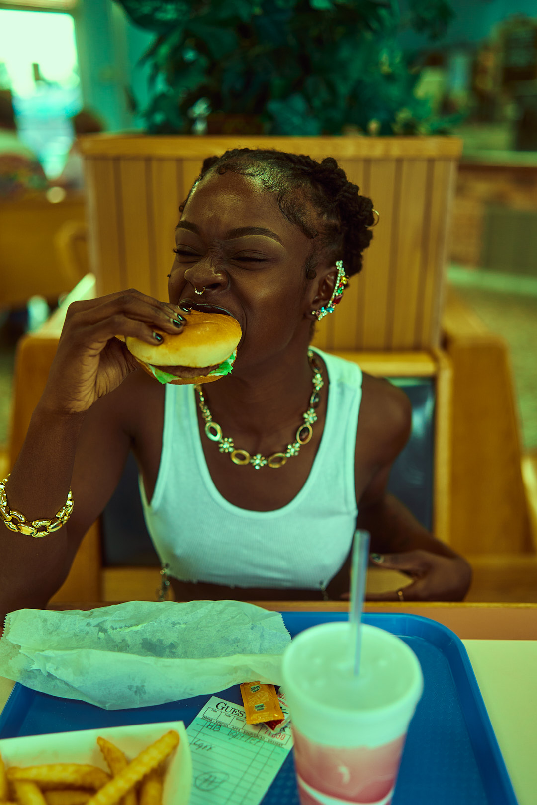
Filmore's Dairy Hut
About
Brief
Create a compelling series of photos using the nostalgic aesthetic of a local dinner called Fillmore's Dairy Hut as the backdrop. The model was free to pick her outfit and I was pleased with her decision. The simplicity of the white tank top and blue jeans played well with the environment. But to add some contrast to the scene I loved the edgy approach to simplicity outfit through the hair and accessories.
Solution


Time Apart
About
This series of photos was created to tell a love story that may never happened. Two people looking love go to the same diner and even sit in the same seats as the other but never at the same time. Wanted to tell the story more visually I decided to turn it into a little short.
Brief
Solution


Headshots
About
Here are a few examples of recent client headshots that I've taken from agency clients to single individuals
Brief
Solution


